Desperados | The Beer with Latin Vibe
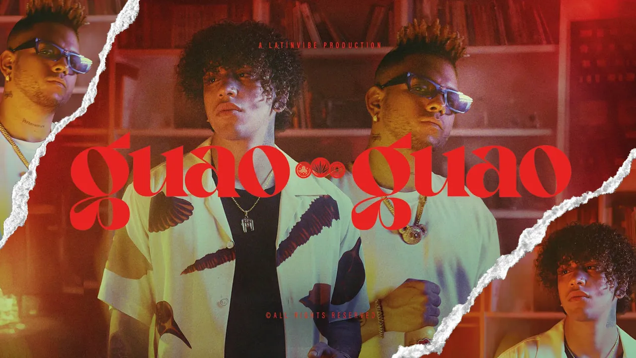
We took Desperados’ iconic torn paper style to a whole new level. At the heart of the refresh was a custom grunge torn font, inspired by the Anton typeface, featuring two unique styles of broken letters that embody the brand’s raw energy. The layout system was reimagined with dynamic compositions, maximizing the use of torn elements to create a bold and expressive look. We also introduced a completely new photography style, carefully crafting lighting and color treatments to emphasize both the main brand and its sub-brands. To ensure consistency and longevity, we compiled all the new visual principles into a comprehensive brand book, setting the foundation for Desperados’ next creative chapter. Agency: LePub
Client
Desperados
DELIVERABLES
Art Direction Brand Design
Year
2025
Role
Design Lead


